This portfolio is desktop-only for now. The mobile version is pending stakeholder approval.
This portfolio is desktop-only for now. The mobile version is pending stakeholder approval.
Client Portal: A New Standard Built on Accumulated Knowledge
Not a redesign from scratch — a synthesis. Everything learned across years of research, user sessions, and product iterations applied to build something new.
Product type
Fintech / Client Portal
Role
Lead Product Designer
Timeline
1 month
Platform
Web + Mobile
Company
IronFX
Problem & Goal
IronFX operates 1.5M+ traders across 180 countries — with some brands carrying design 10–15 years old. Exo was the chance to change that.
This project had a built-in advantage: years of accumulated research from the same ecosystem. The problems were already known. The question was: if we could build this portal without legacy constraints, what would it look like?
The task: set a new standard — modern enough to attract new traders, functional enough to serve experienced ones.
User Problems
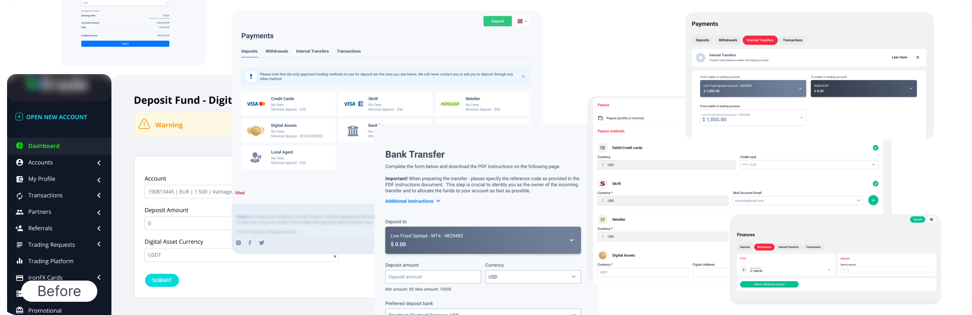
Financial flows (deposit, withdrawal, transfer): everything on one page, no steps, no guidance
Account confusion at deposit: users didn’t understand they needed a different account type
Profile: dense, unstructured, marketing-heavy, important info buried
Navigation: too much time finding basic sections
Key actions in small sidebars and popups — not suited for desktop traders
Business Problems
Oldest and largest brands had 10–15 year old design — hard to attract new clients
No modern design reference to evolve toward across the brand portfolio
Deposit confusion led to support load and drop-off on revenue-critical flows
Sidebars and popups made financial actions feel small and unimportant
Needed a standard the whole ecosystem could follow
Project Constraints
Shared infrastructure: Portal shares front-end and back-end with other brands. Some patterns constrained by codebase.
No prior design files: Starting from zero.
1 month timeline: Full portal including all flows and mobile adaptation.
Marketing requirements: marketing wanted heavy KYC promotion throughout. Had to negotiate scope and visual weight.
Two designers: I led UX strategy and flows. Co-designer handled branding, visual execution, and illustrations.
No Exo post-launch metrics: Design was passed to developers as reference for T4Trade, which went into production.
My Role
Led UX strategy, research synthesis, and all flow design. Defined information architecture and interaction patterns. Co-designed with one other designer who owned the visual language and branding.
Research synthesis
Translated years of accumulated data into UX decisions. Every flow grounded in observed behaviour.
UX & flows
Defined all key flows: deposit, withdrawal, transfer, account creation, profile. Step structure was my initiative.
Quality review
Final UX review on all screens. Ensured flow consistency. Presented final design to stakeholders.
Stakeholder alignment
Worked with PM team, marketing, and stakeholders throughout. Negotiated marketing requirements to protect UX.
Design Workflow
Research wasn’t a phase — it was already done. The workflow started where most projects end: with clear, data-backed understanding of what needed to change and why.
Stage 1: Accumulated Research
Applied years of Mouseflow sessions, heatmaps, support ticket data. Research wasn’t a phase — it was already done.
Stage 2: UX Decisions
Each UX problem mapped to a specific solution: deposit flow, accounts, profile, navigation — grounded in observed behaviour.
Stage 3: Competitive Analysis
Reviewed Revolut, Wise, N26, Monzo, Trading 212 for deposit flows, account management, and modern fintech IA.
Stage 4: User Flows
Deposit (all methods), trading account creation, account management, profile. Mobile-first throughout.
Stage 5: Final Design
Full portal: 30 screens + mobile adaptation. Light minimalist visual direction. Design system built inline with screens.
Stage 6: Review & Handoff
Design reviews with co-designer and stakeholders. Figma handoff with annotations. Approved as reference direction for other brands.
Stage 1: Accumulated Research
Years of working with the same product ecosystem meant the research phase was synthesis, not discovery. Three sources of accumulated knowledge:
Behavioural Data
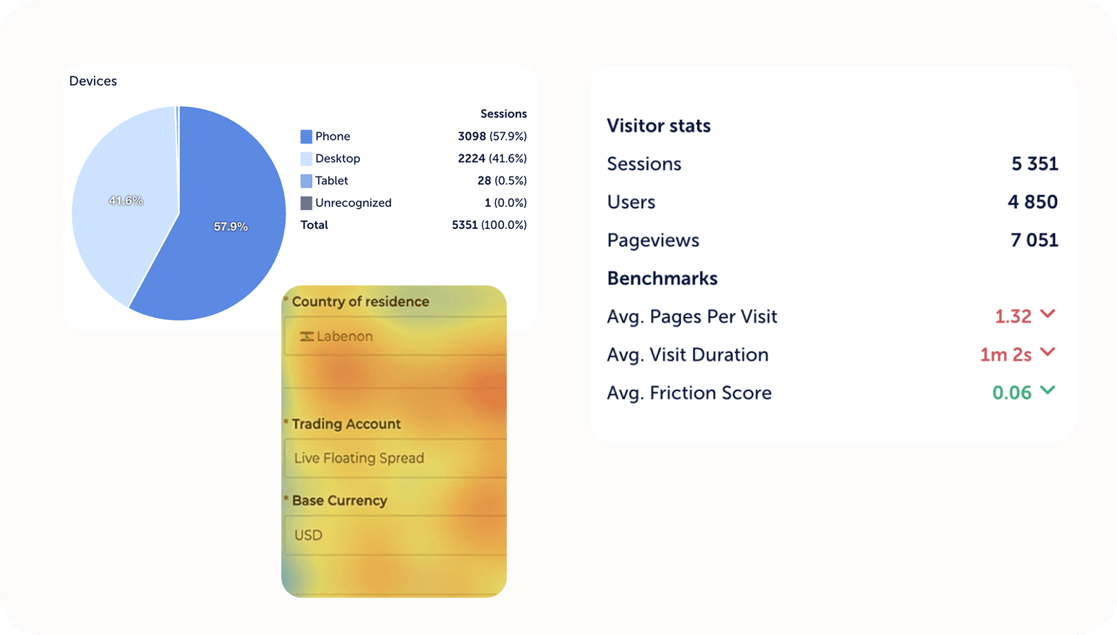
Mouseflow session recordings: users frustrated, excessive time on deposit/withdrawal pages, wrong taps, abandoned flows mid-process
Heatmaps: high click density on non-interactive elements, low engagement on primary actions
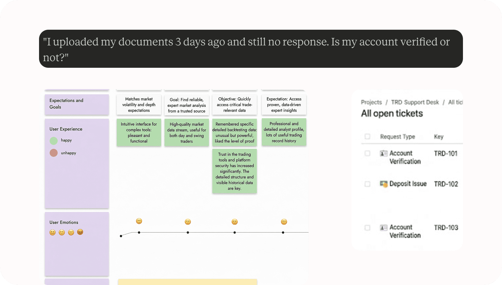
Support ticket patterns: deposit confusion, account navigation errors, status misunderstandings
Team observations: knowledge from developers and support built over months of direct user contact
Competitive Research
Reviewed modern fintech flows to identify what users now expect from financial products:
Key Insights from Competitive Research
Step-by-step structure reduces abandonment — users need to see how long a process is
Progressive disclosure in deposit: show bank details only after form is filled
Account grouping by type reduces selection errors
Full-page flows for financial actions — not popups — better for desktop traders
Contextual inline hints reduce confusion without disrupting flow
Clean hierarchy: amount and currency as the dominant elements
Stage 2:
UX Decisions
Each UX problem was mapped directly to a design solution. Below — the four core areas redesigned, with the research insight that drove each decision.
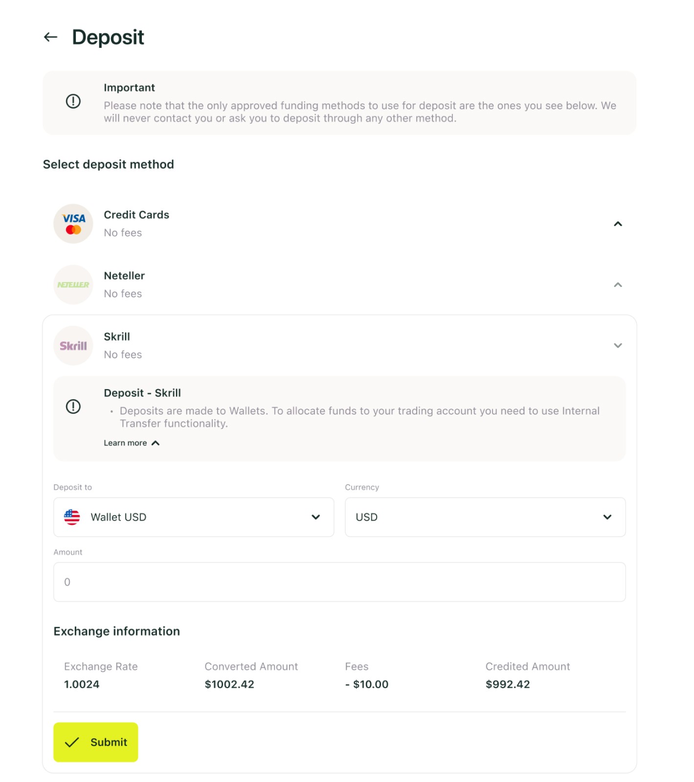
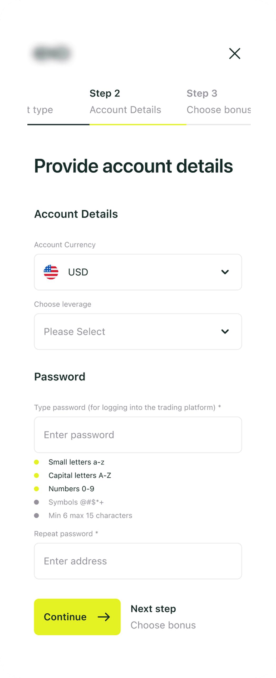
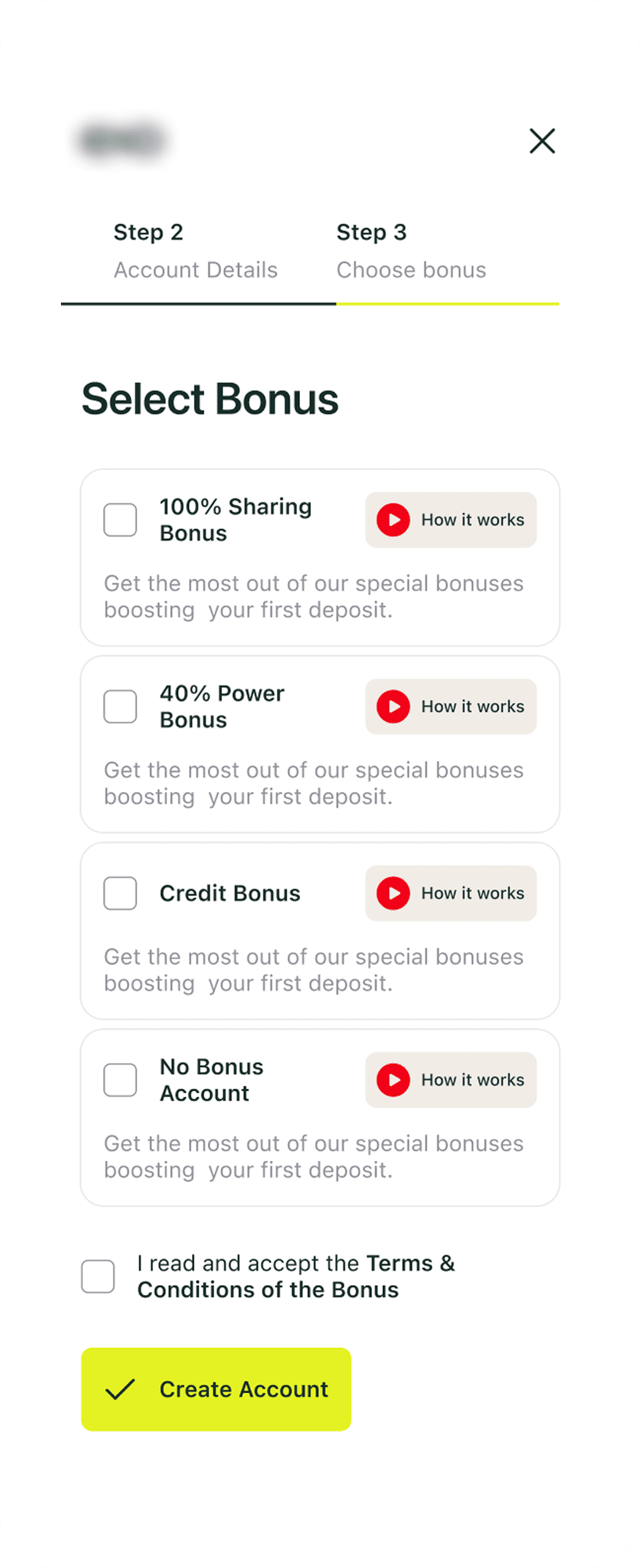
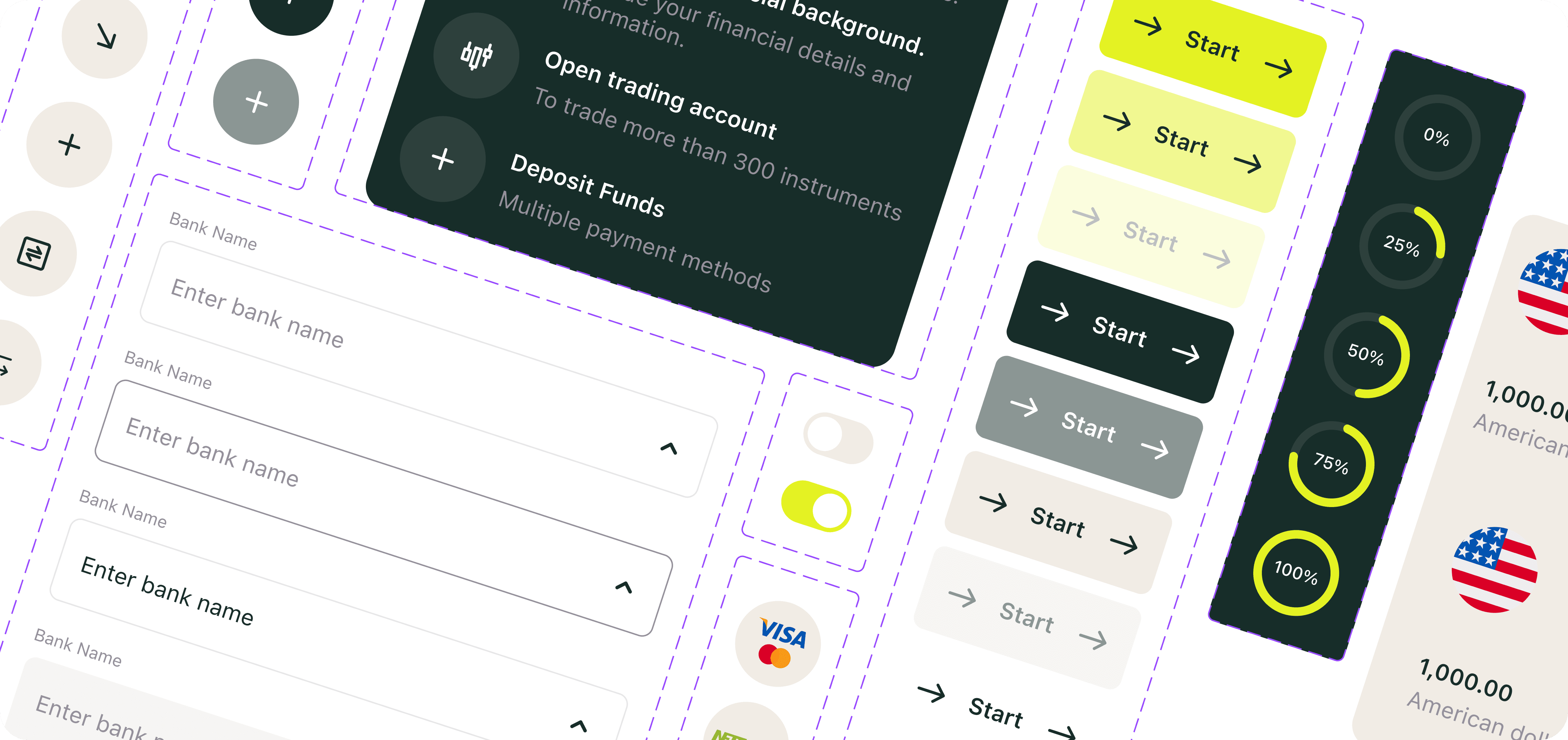
Deposit, Withdrawal & Internal Transfer
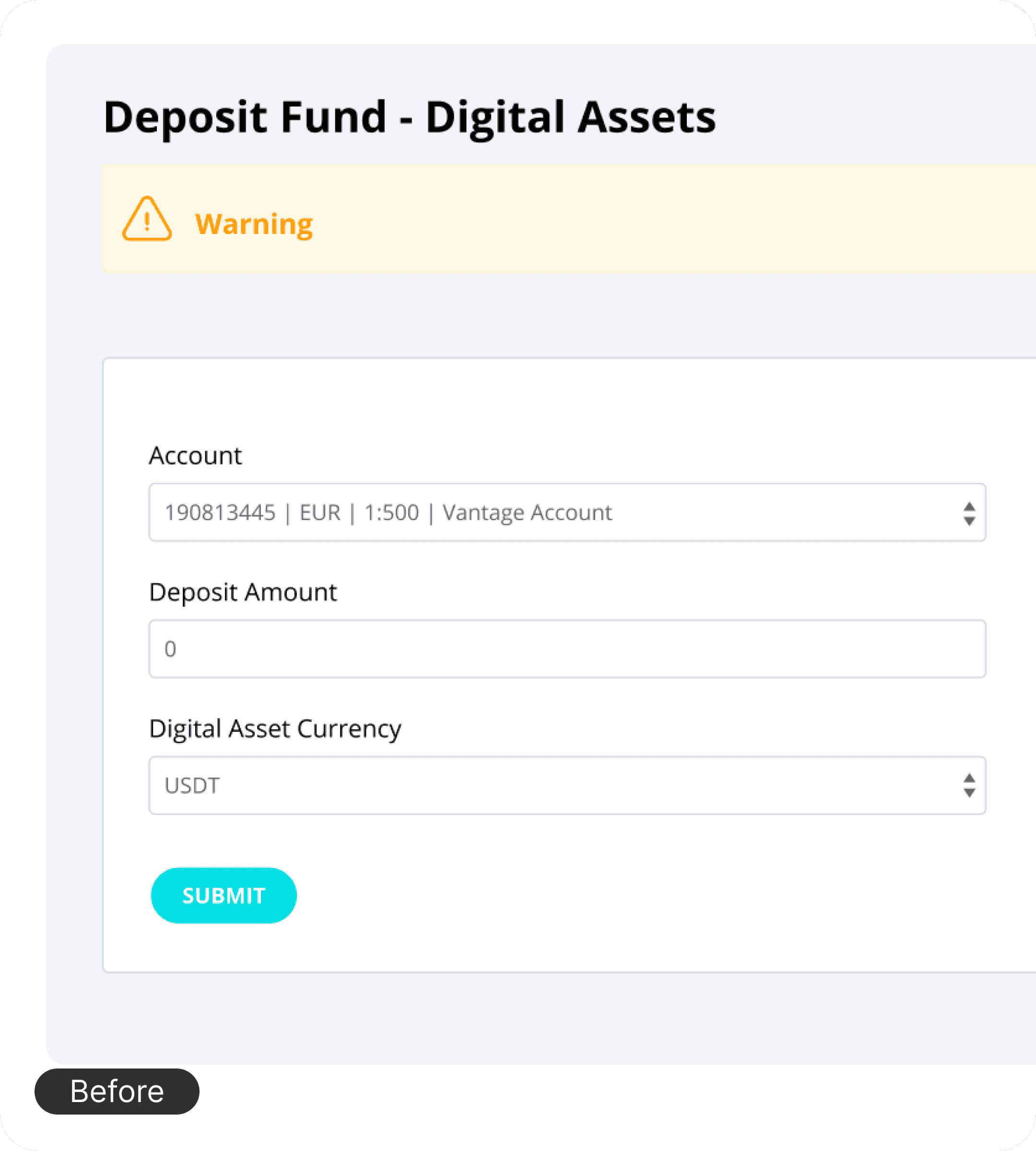
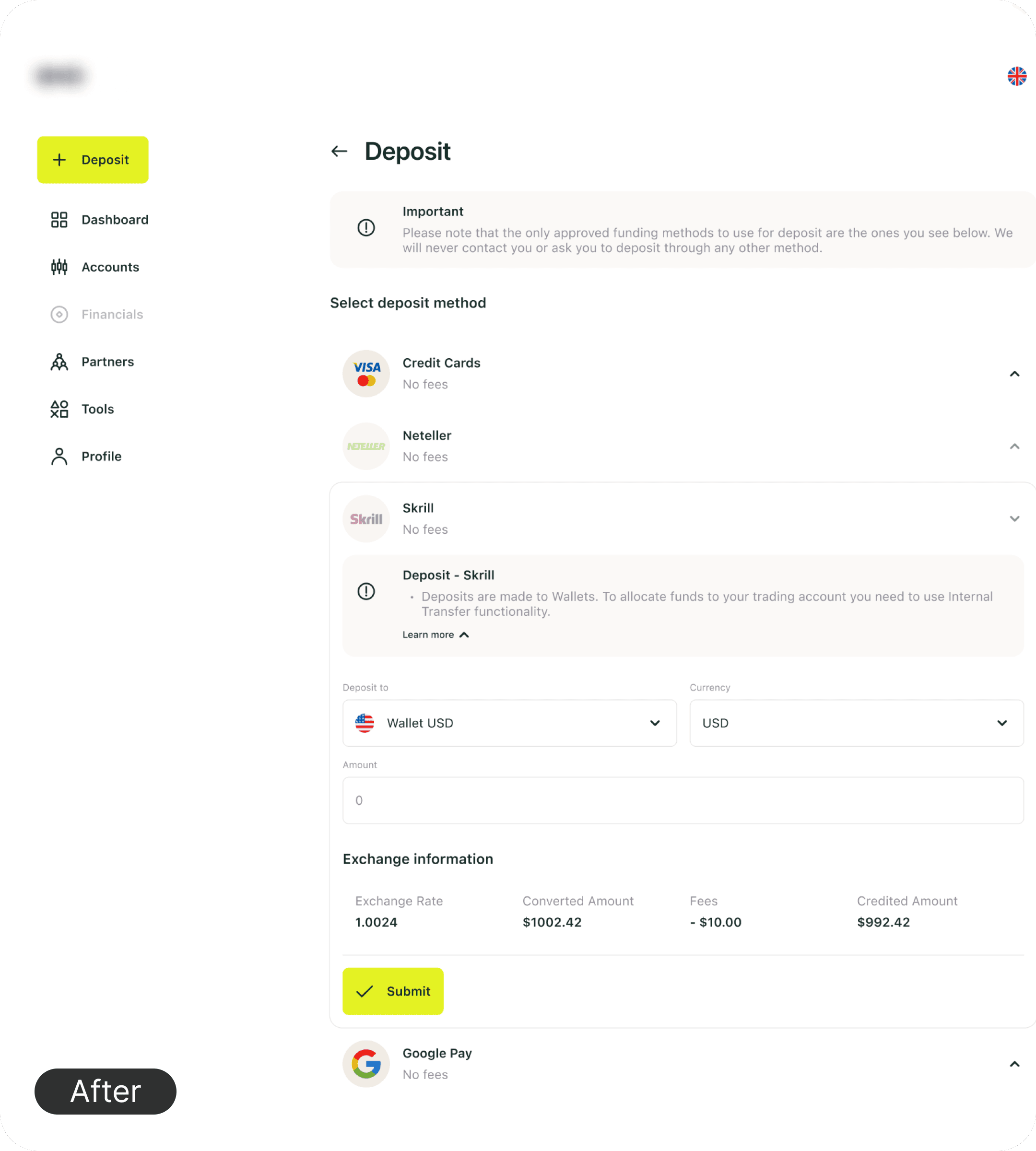
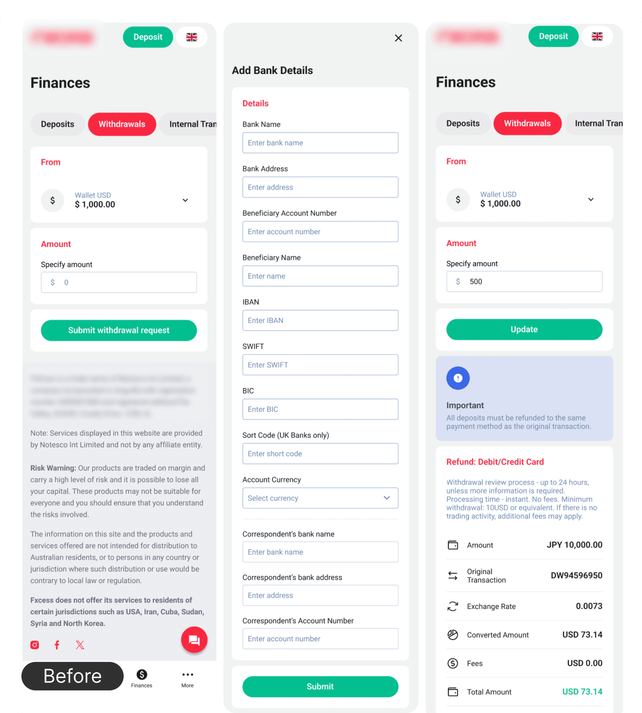
The problem: All financial flows were presented as single long pages: form fields, instructions, bank details, and confirmations all visible at once. No sequence, no guidance. Users couldn’t tell what to do first. An additional layer of confusion: users tried to deposit to accounts that didn’t support it, not understanding they needed to switch account types first. The system gave no explanation.
The solution:
All financial flows broken into 3 clear visual steps — my initiative, carried over from KYC redesign approach
Progressive disclosure: bank details appear only after user selects amount, currency, and bank
Contextual hints added inline in forms — explaining account types and what each field means
Account confusion addressed with clear inline guidance: which account type supports which action
Same 3-step structure applied consistently to deposit, withdrawal, and internal transfer
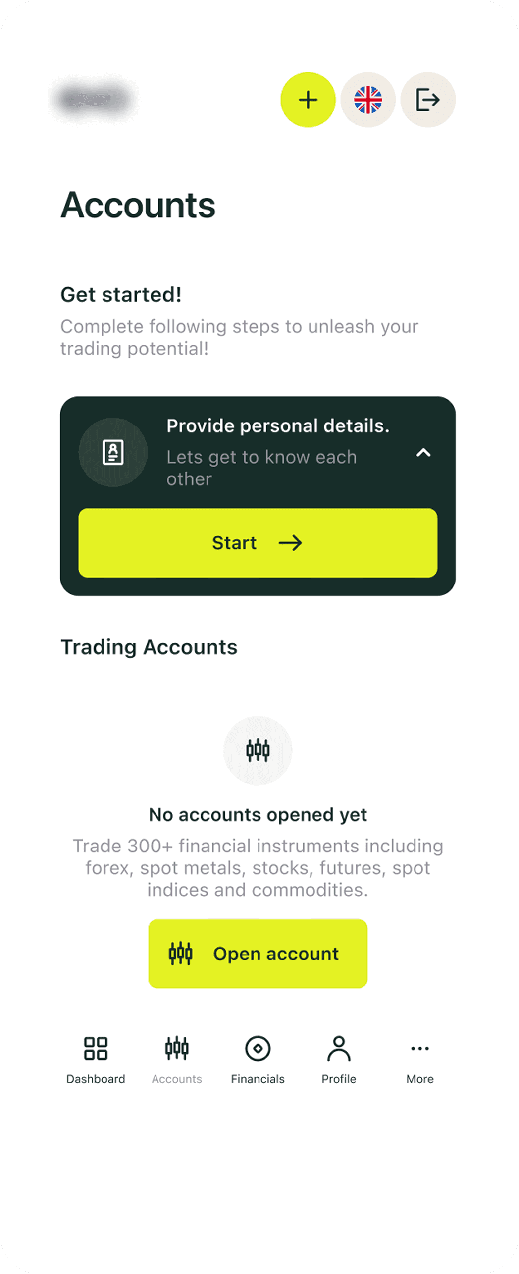
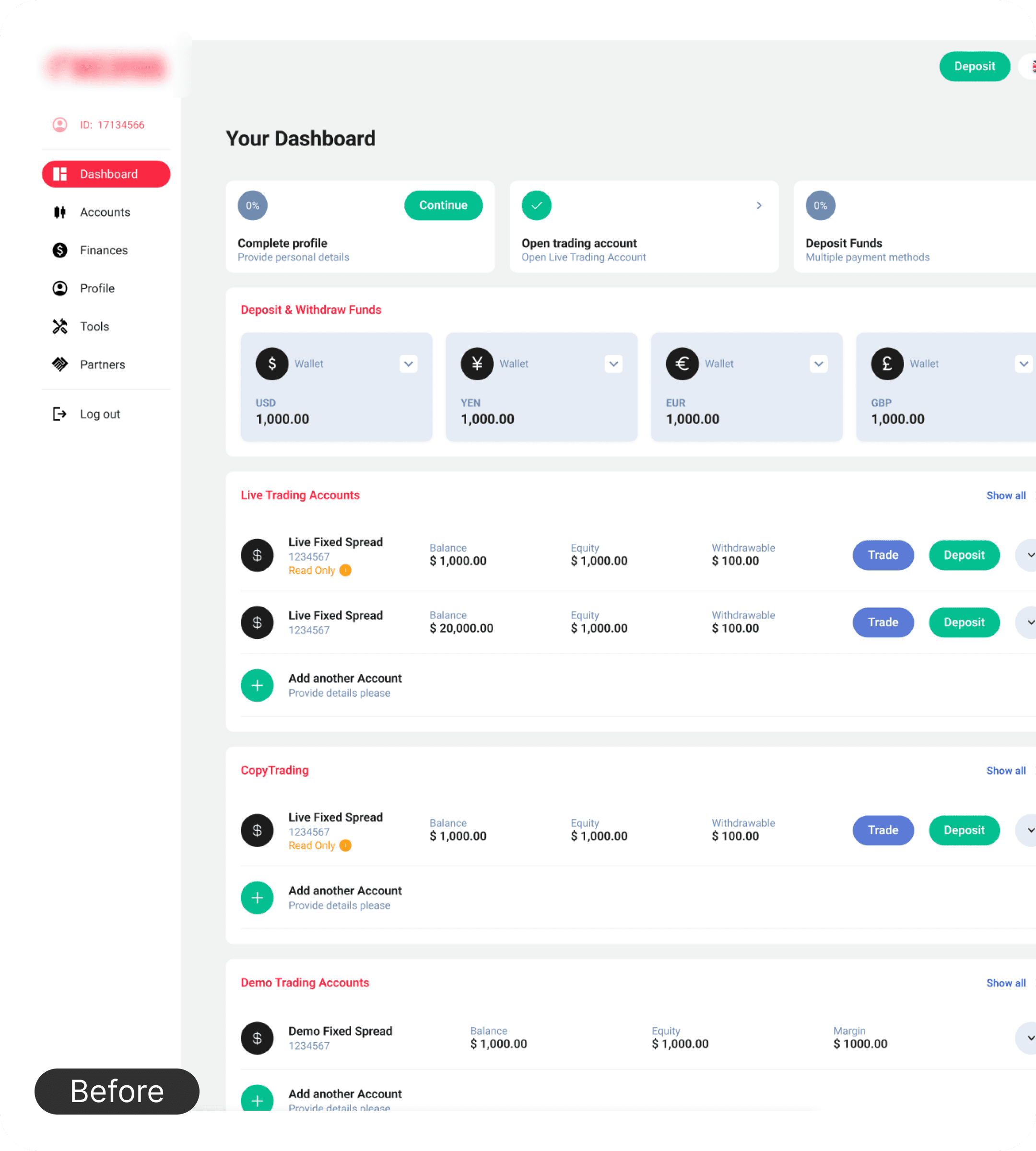
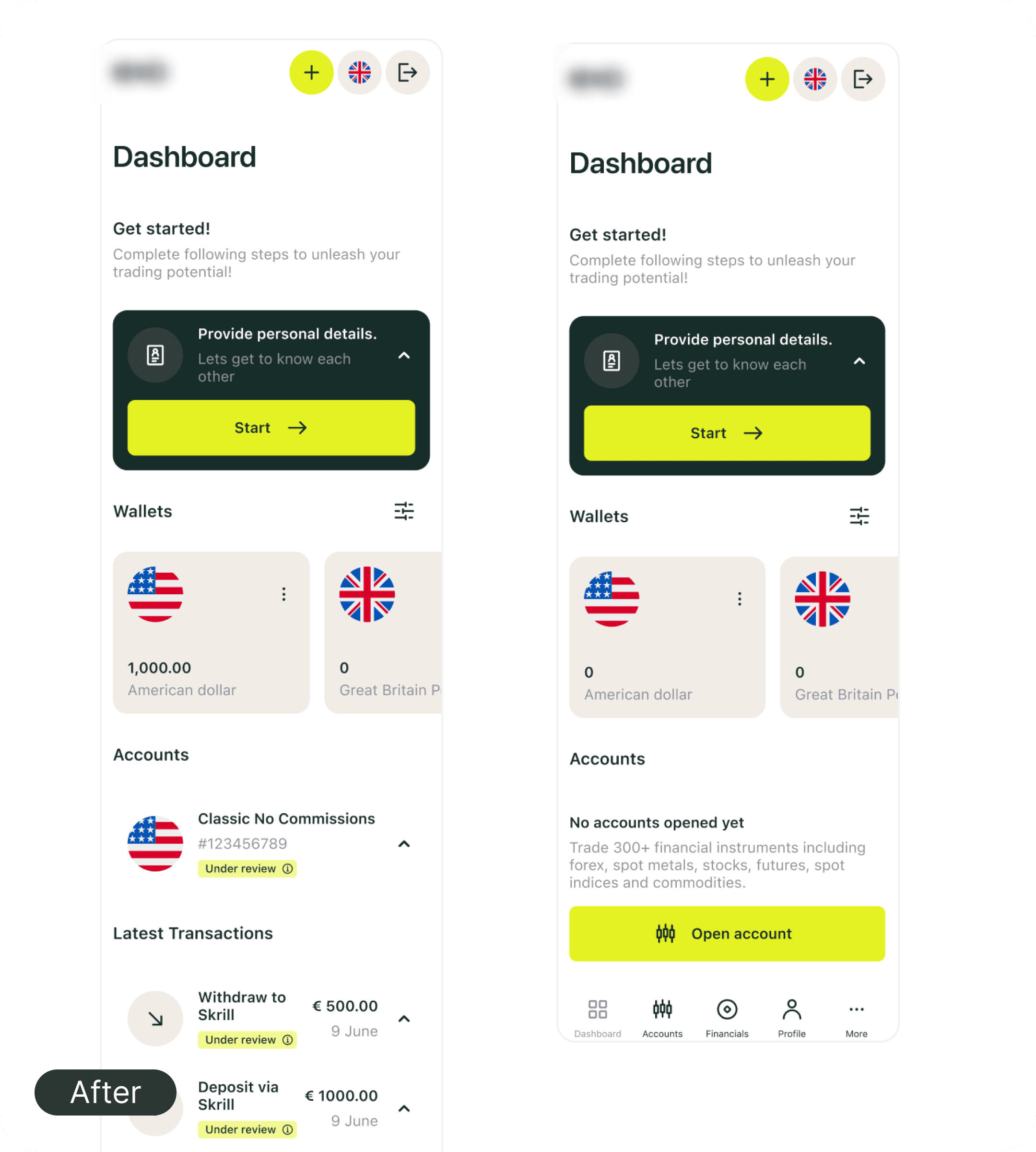
Account Display
The problem: All account types — wallets, trading accounts, different currencies — displayed as a flat mixed list. Users couldn’t quickly identify which account they needed, leading to wrong selections and deposit errors.
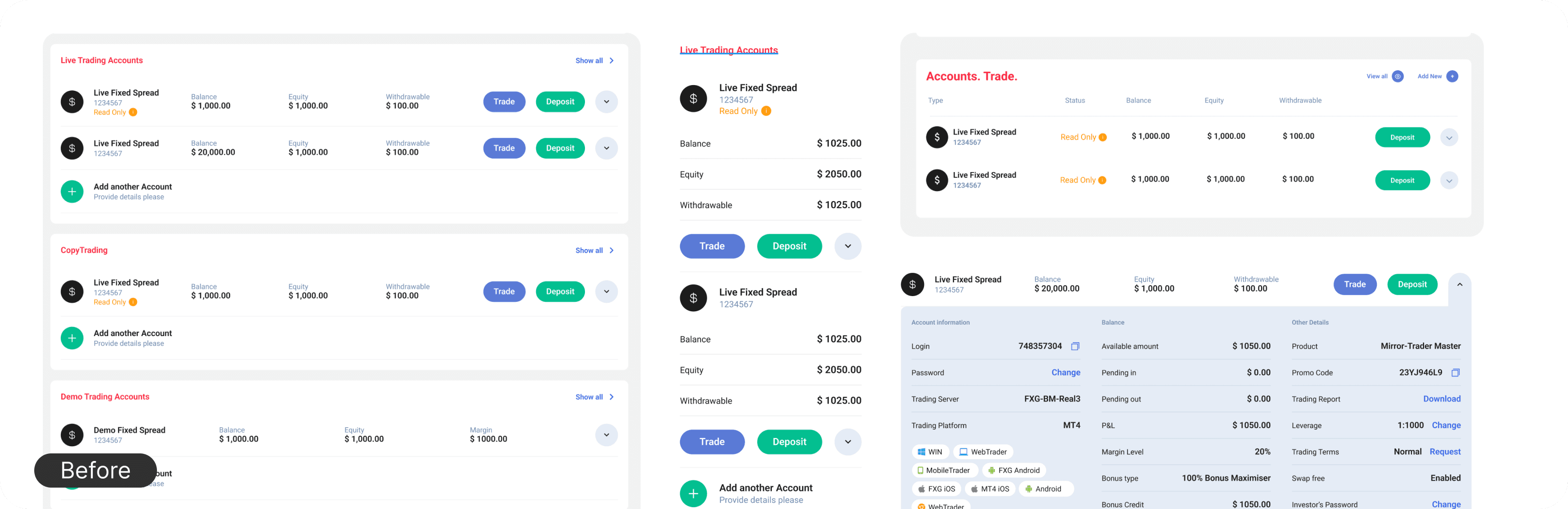
The solution:
Accounts grouped by type: wallets separate from trading accounts
Account type, currency, and balance clearly visible at a glance
Reduces the most common deposit error: selecting the wrong account type
Profile
The problem: Profile was a single long scroll with no section structure. Marketing wanted large KYC prompts and heavy text blocks throughout. The result: a dense page where nothing felt important because everything competed for attention.
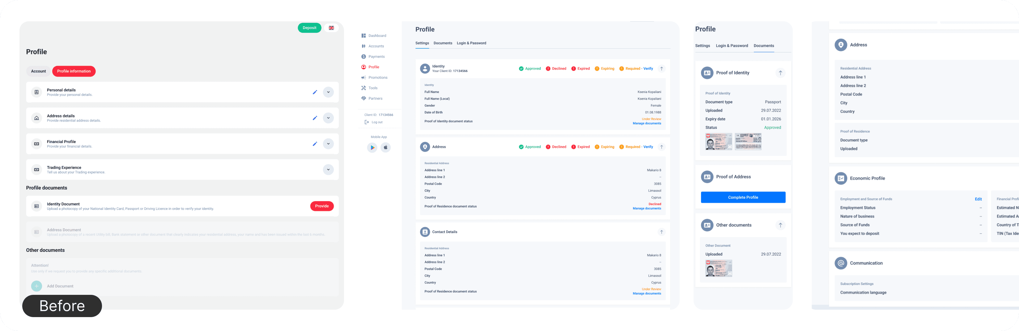
The solution:
Profile divided into clear sections — negotiated with marketing to reduce KYC text weight
KYC status surfaced clearly but not aggressively — present without dominating
Reduced field density — only what’s relevant shown by default
Connected to KYC improvements from the previous project — same logic, consistent language
Stage 3:
User Flows
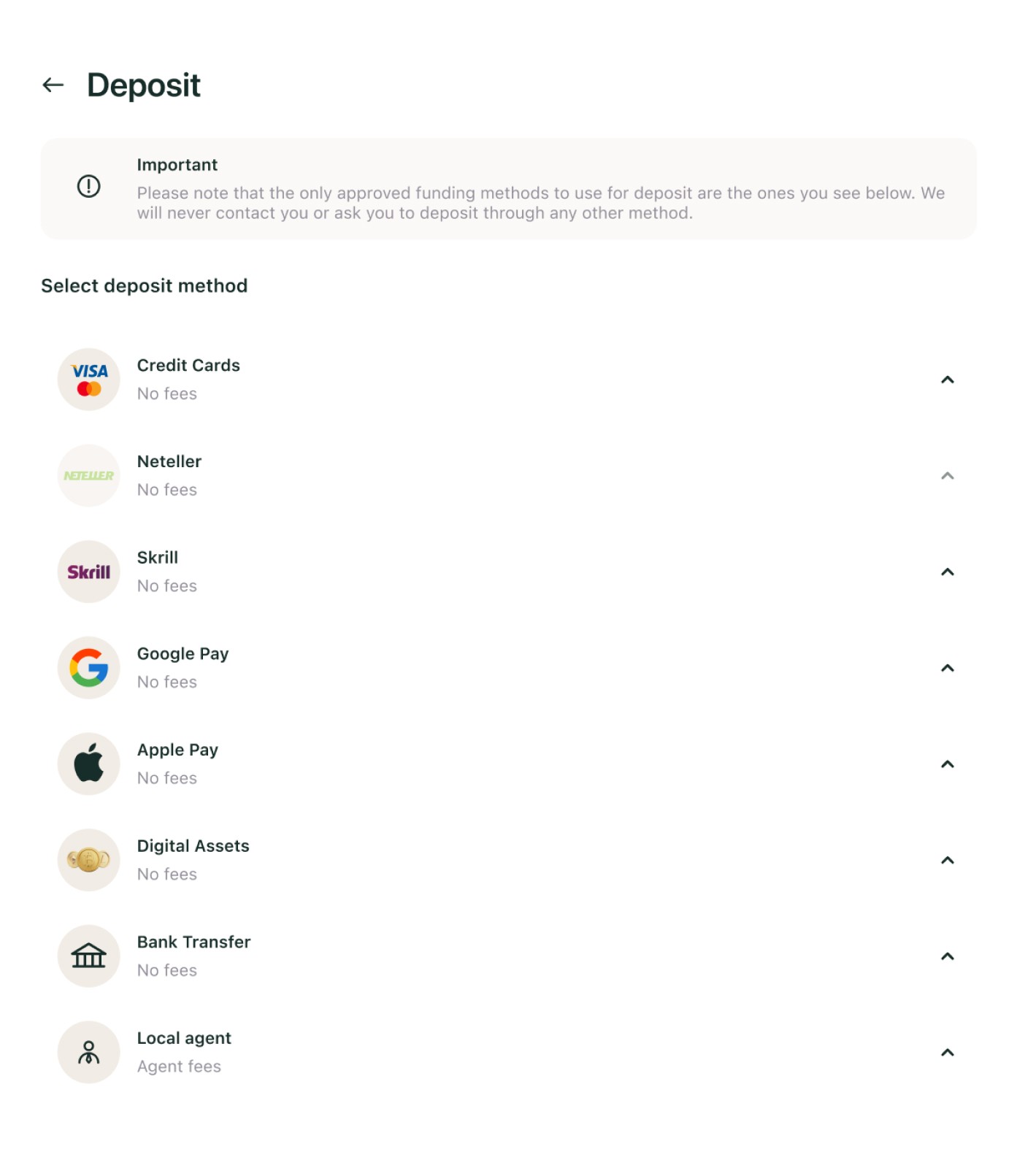
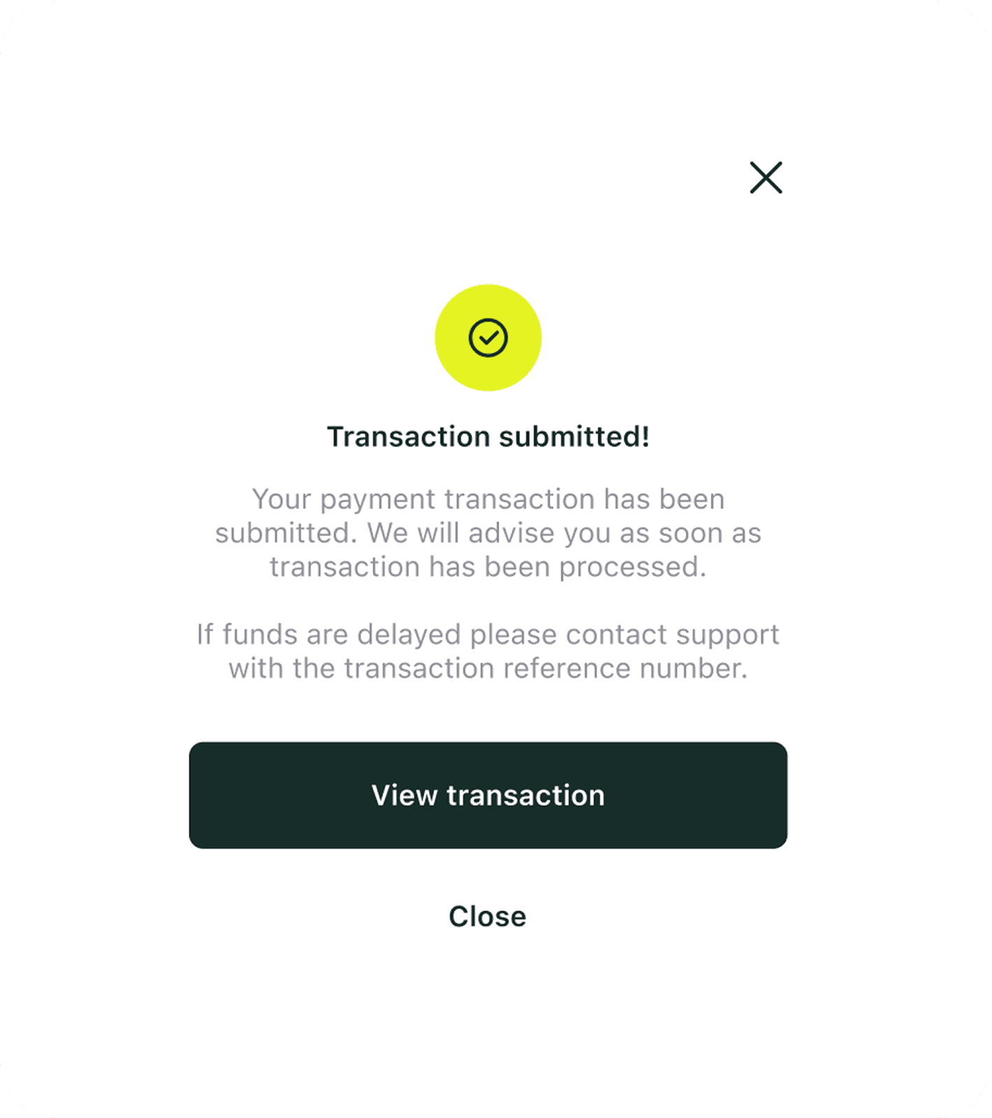
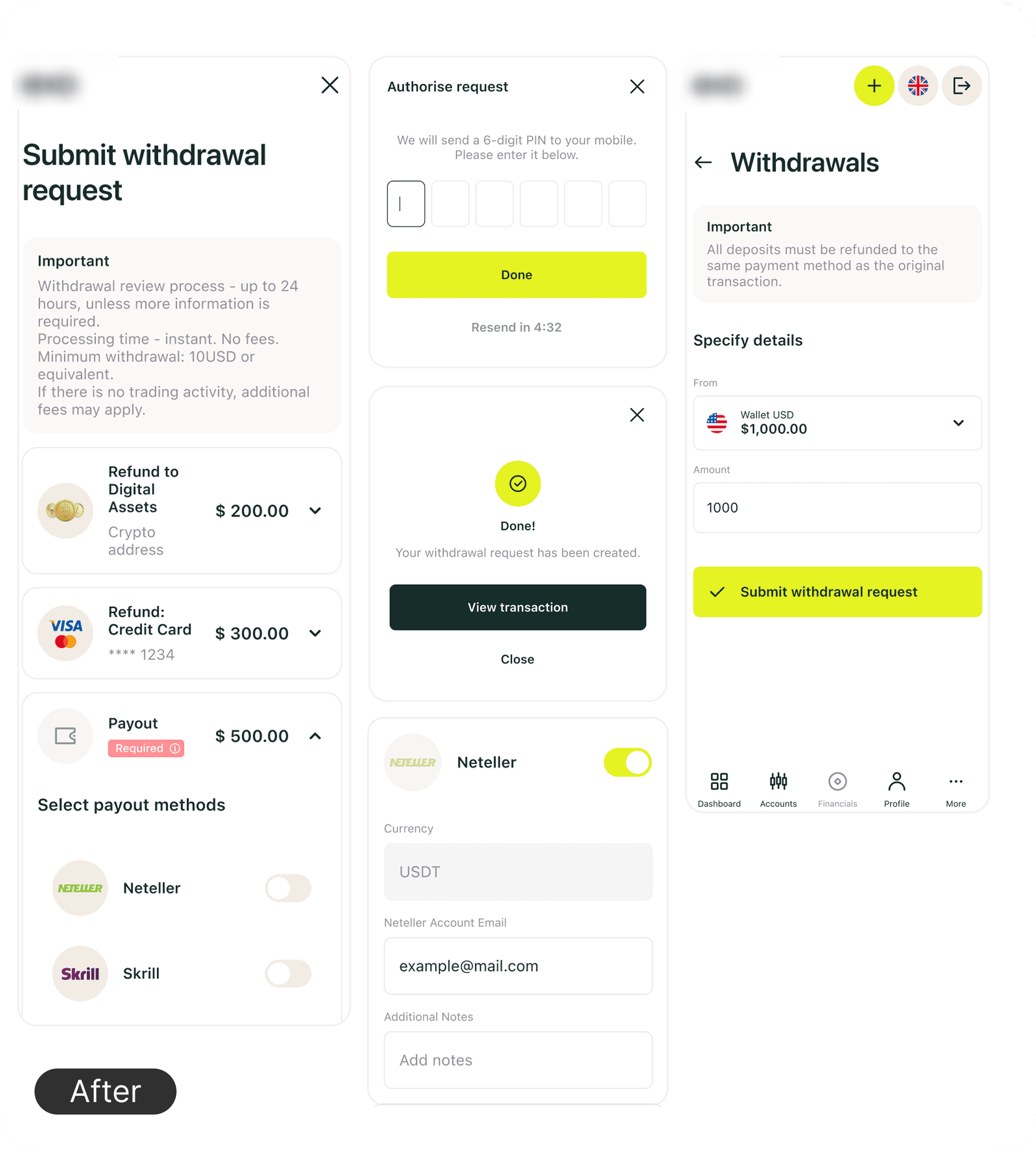
Financial flows were redesigned around reducing friction at every step. Deposit — previously scattered across multiple pages with unclear sequences. No redirects, no unnecessary fields, key parameters accessible immediately. The goal: get money in with the minimum possible clicks.
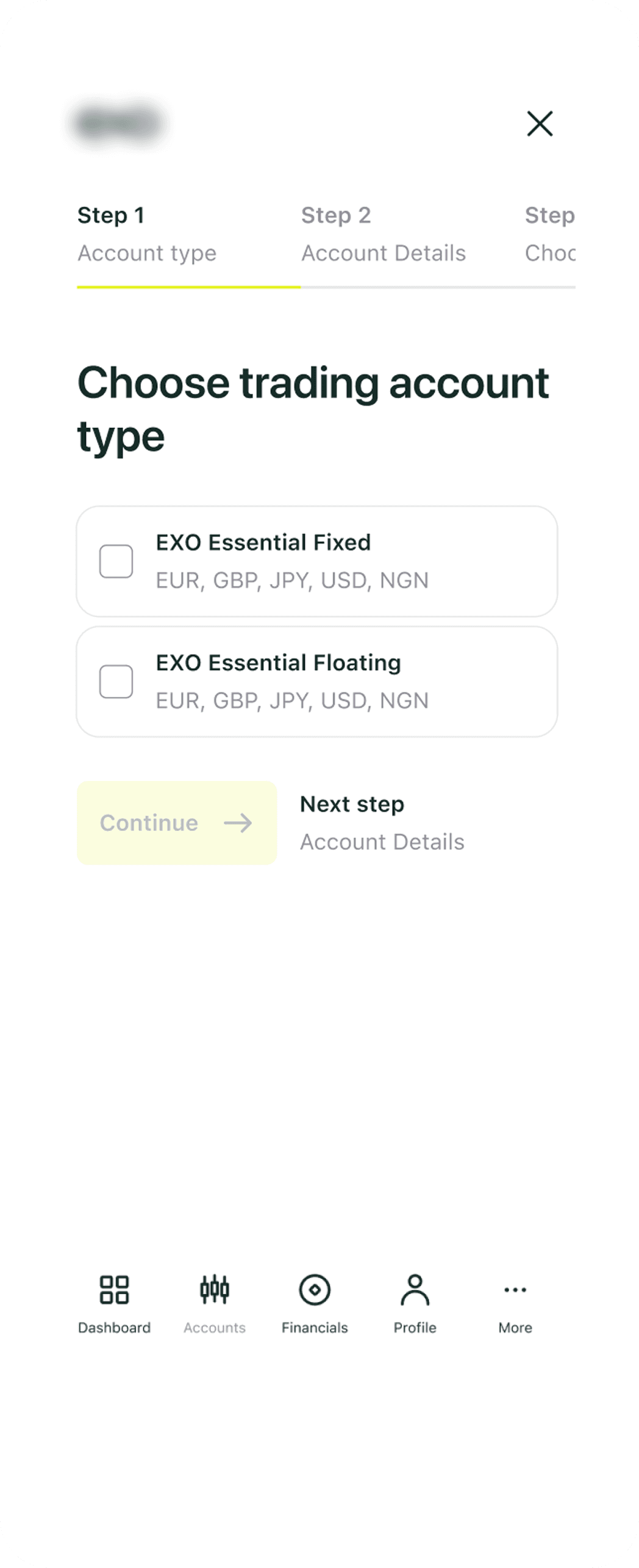
Trading account creation was guided by a visual progress bar — showing progress and remaining steps, keeping users oriented and motivated to complete the flow.
These two flows illustrate the approach applied across all key financial actions in the portal — deposit, withdrawal, internal transfer, and account management all followed the same principle.
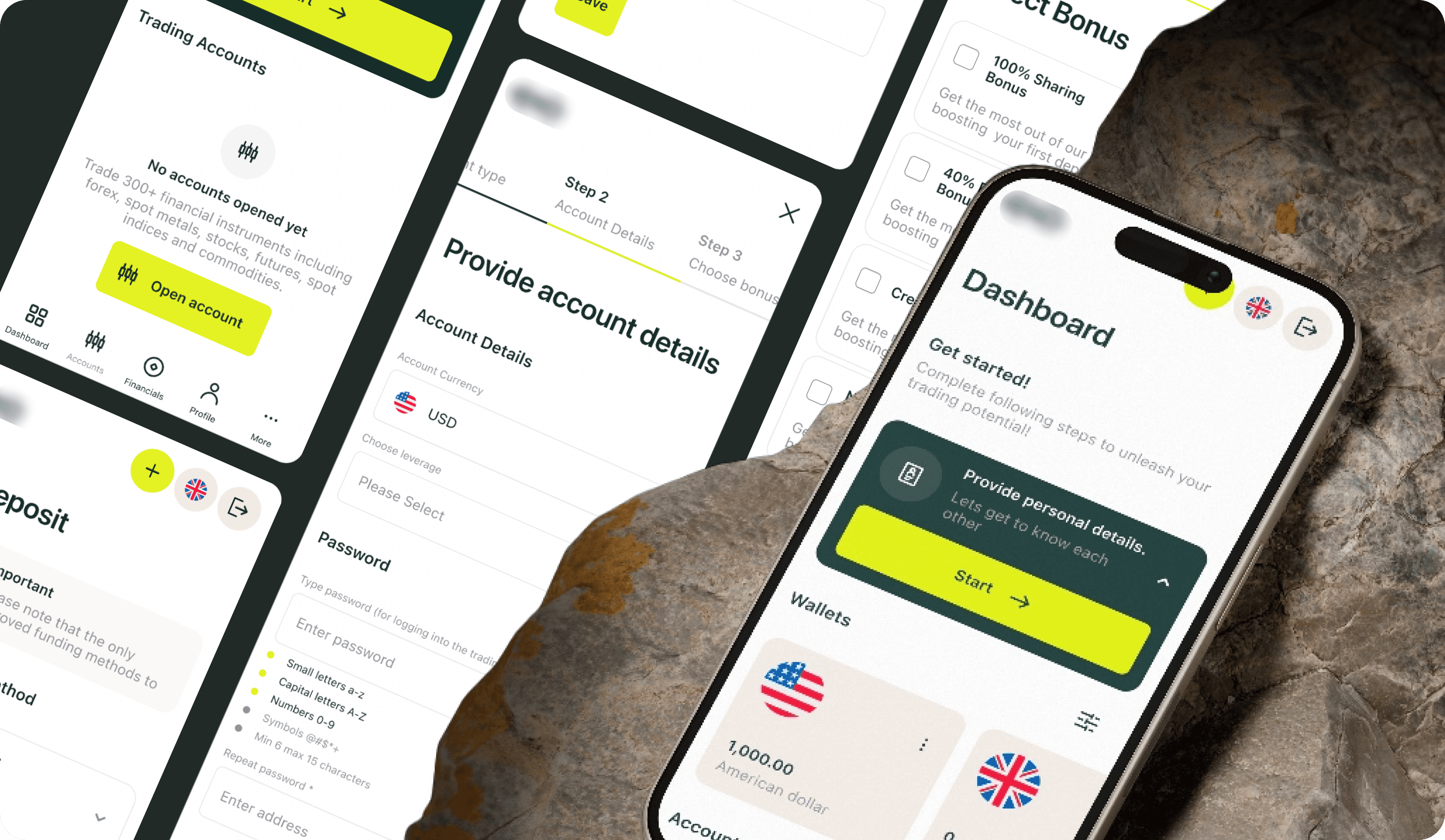
Deposit Flow
Step 1: Select deposit method → Step 2: Set parametrs → Confirmation + Transaction Info
Trading Account Creation Flow
Open Account → Step 1: Choose trading account type → Step 2: Provide account details → Step 3:Choose bonus if applicable → Confirmation
Stage 3:
Final Design
Light minimalist visual direction — clean, modern, bank-grade. My focus: UX logic, flow structure, information architecture. Co-designer owned visual language, branding, and illustrations.
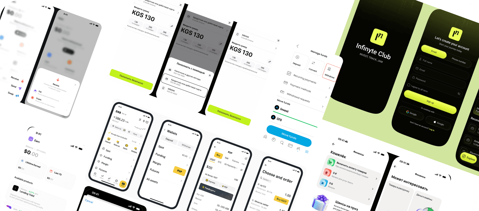
Deposit Pages
Withdrawal & Internal Transfer Pages
Dashboard Pages
Design System
Results & Impact
Years of working with the same product ecosystem meant the research phase was synthesis, not discovery. Three sources of accumulated knowledge:
Design outcomes
Complete portal redesign in 1 month with 2 designers
30 screens + design system + mobile adaptation
All financial flows restructured into 3 clear steps
Account display redesigned: flat list → grouped by type
Full-page flows replaced sidebar/popup pattern
Design system built from scratch, handoff-ready
Business outcomes
Stakeholder approval on first presentation — no major comments
Passed to developers as reference —implemented on a live brand within the ecosystem
Established new UX and visual standard for the brand ecosystem
First portal in the company to reflect modern fintech design standards
Sets the direction for updating older high-traffic brands (IronFX: 1.5M+ traders)
The portal sets the design direction for updates across the entire brand ecosystem — serving 1.5M+ traders across 180 countries. Implemented on a live brand within the ecosystem; broader rollout metrics in progress.
Learnings
Research compounds over time
Years of Mouseflow data, heatmaps, and support patterns meant no discovery phase was needed.
The best research asset is the one you’ve been building without realising it.
Building the reference sets the standard
When this portal became the direction for other brands, every decision in it became a principle.
The best way to influence a product ecosystem is to make something others want to follow.

Some details are protected by NDA and not included here. If you'd like to learn more about the full process, challenges, and results — feel free to reach out.